
So I chose the Blink 182 logo which is amazing graphically. I've always admired it maybe because im a little obsessed with Blink 182.

I started with the outer ring and created a slightly smaller one to then fit together by putting square sections onto the rims to make it secure, and to sart the 3D process off.
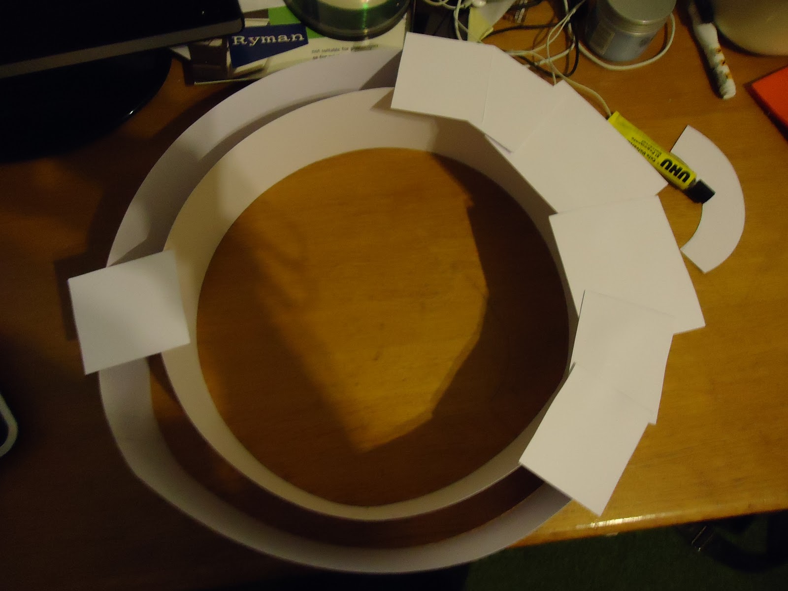

After that I smoothed the sides down and created boxes on the left hand side of the circle as the inside parts of the arrows, five in total.


The next stage was to create the arrows which was simple enough create one template and produce four others and then secure the backs to them.

The next part of the process was the smaller circle with same techniques as the larger one and to start the measurements for the facial features to fit inside the circle.


I repeated the same process all the way threw to create the 3D effect.


If I were to do it again i would tweak a few things e.g the size and the outer circle could be more precise. This was maybe because of the time factor and how long I was spending on making it.


I have challenged myself to create something I perhaps wouldn't have thought too, until I researched Bert Simons he inspired me to do something different. To take this further and use it on my final piece I will take a piece from it and repeat it over and over, it might be the arrows the circles or part of the face.
No comments:
Post a Comment