Monday, 14 March 2011

Final Poster For G F Smith Paper

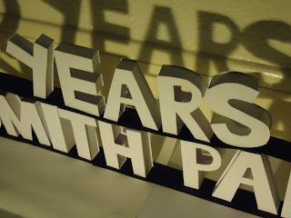
My final poster design is largely made up off 3D block letters for the main part of the poster I integrated the shadow and I think it adds a bit of depth to the lettering.


Im really pleased with the final product and how the colours work in unison, and using all the techniques that I learned in the workshops. Also carrying on the theme of 3D forms which has carried on  through in everything iv'e done.  

Wednesday, 9 March 2011

Starting My Final Poster Early Stages

The beginning stages of my 3D paper design for the poster.
Starting to take shape this process was repeated all the way through.
Finished 3D product took about nine hours to carfully make and place on top of each other but was definatley worth it.


Using the shadow to make a huge difference looks more graphic.


All ready to make the poster, choose the right photo, scan it into photoshop and change the lighting to enhance the colour and shadow. Add design museum 01-31 july in a suitable text and print it off.

Friday, 4 March 2011

Taking 2D Forms And Turning Them 3D

After the 2D experiments and looking at how my poster could be a 2D  design I decided to look at how I could make a poster with 3D paper designs.

After a while I realised that with 3D you get amazing shadows that enhance the look. It's very effective and works well.


After a lot of playing around I realised I did like how shadows could be used in a effective way and this made my mind up that In my final design I would use shadows.

Working With 2D Paper Forms On G F Smith Paper

Working with coloured paper and layout to experiment for ideas about G F Smith paper.

Using different colours for each part of the G F smith paper helped with not only position and arrangement it was giving me choices on what colours looked better than others and if I would use them in my final design.

Ilike tis arrangement the most because even though it's 2D it has the impression that it is in fact 3D and it looks visually good.


Thursday, 3 March 2011

Looking At Poster Designs

This poster is my favourite out of the ones I have chosen to look at I like that it isn't all bright primary colours which sometimes I think takes away from an actual poster and what it's advertising. This a good example of basic colous scheme with as few as 3 or 4 colours and the arrangement of type is used efficiently.
These type of posters are more common now with a lot of people using computer programes like photoshop and illustrator. It is very basic and formal and uses subtle tones of colour.
For me this poster I think was hand drawn designed and the used as a guide line and photoshoped over the top it is one of those posters that's very vibrant and in your face and eye catching.
You get alot of posters that don't concentrate on type, that focus on the image or images to advertise what it wants the audience to  know.
In other Posters you can get type and image used in unison and is used in such a way that maybe it is the only technique to completely get the audiences attention.

Wednesday, 2 March 2011

Starting Task 2 G F Smith

In the 1880's Mr GFSmith (George Frederick) and his brother Mr TJ Smith
(Thomas James) ran two small companies from premises in North Church Side in Hull.

GFSmith have been trading as specialty paper merchants from their warehousing and manufacturing base in Hull, East Yorkshire for over 100 years. GFSmith source, develop & manufacture some of the most unusual papers for the Graphics and Printing Industries, promoting new papers for a wide range of applications.


These range from simple business cards, to letterheads, folders, promotional brochures, report & accounts, greetings cards & packaging.

Saturday, 26 February 2011

Final Sculpture Piece

My final piece is formed from inspiration from the Blink 182 logo I made. I used the basic design of the eye and repeated it over and over and played around with the structure.

I continued with using paper and turning it into a 3D form exactly how I had with other forms e.g arrows and Blink logo.

I decided to make a fianl piece that wouldn't be to big or something that woud be delicate so I made a sculpture that would be solid and hold up very well.


I think my final piece is a repetitive, evidence of pre-planning and experimentation. My final outcome looks creative and im pleased with how it has finished.

Friday, 25 February 2011

Another Prototype Blink 182 Logo

I decided to get creative and start making the scale bigger and using the Blink 182 logo that is graphically stunning, that is repetitive and something that was going to challenge me, for me I had a image in my head ever since I looked at Bert Simons and said that I wouldnt have thought to puzzle something together. I thought why not challange myself to do something similar.
So I chose the Blink 182 logo which is amazing graphically. I've always admired it maybe because im a little obsessed with Blink 182.

I started with the outer ring and created a slightly smaller one to then fit together by putting square sections onto the rims to make it secure, and to sart the 3D process off.


After that I smoothed the sides down and created boxes on the left hand side of the circle as the inside parts of the arrows, five in total.

The next stage was to create the arrows which was simple enough create one template and produce four others and then secure the backs to them.
The next part of the process was the smaller circle with same techniques as the larger one and to start the measurements for the facial features to fit inside the circle.


I repeated the same process all the way threw to create the 3D effect.


 If I were to do it again i would tweak a few things e.g the size and the outer circle could be more precise. This was maybe because of the time factor and how long I was spending on making it.


 I have challenged myself to create something I perhaps wouldn't have thought too, until I researched Bert Simons he inspired me to do something different. To take this further and use it on my final piece I will take a piece from it and repeat it over and over, it might be the arrows the circles or part of the face.